buyer
campaigns
client
marketing dollar
mississippi
persona
ROI
sales cycle
team work
telecommuting
web design
Web Design Shop
web development
website
Old and outdated or does your website just need a new “font refresher”?
Old and outdated or does your website just need a new “font refresher”?
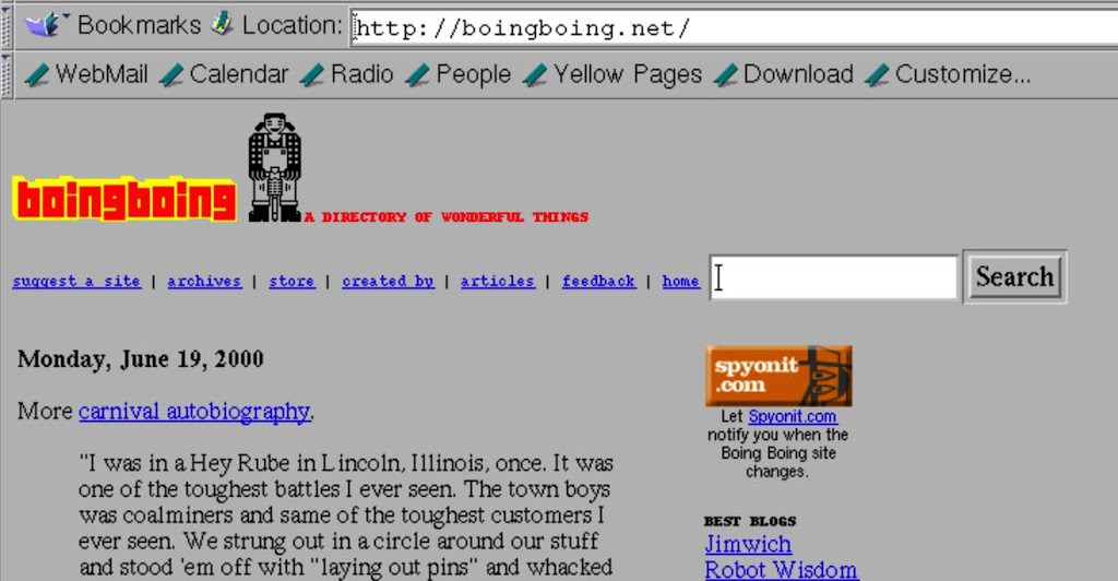
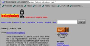
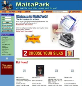
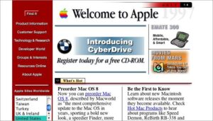
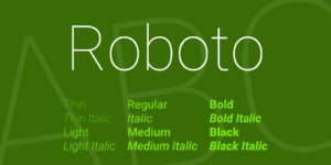
When you reviewed your website yesterday for “call to actions” and easily visible options for potential customers to interact with you, did you notice if your site is looking a little old? When I say old, does it look like it was created a couple of years ago, some of the information is not relevant anymore and you have either discontinued or added some new products and services? If you have answered “YES” to any of the above it is time for a revamp. Now, a revamp could be as little as changing the font. Popular fonts today are typically clean and straight. Not too many “frills”. I personally like Lato, Gotham and Roboto. If you think that it needs a little more than just a “font refresher” make notes of the areas you think need some help. Be brutally honest…it is better to have a longer list which can be broken down into “have to change”, “would be nice to update” and “would be awesome to have a new vibrant image” groups. Below are some images of some really old websites that are no longer live…I have one client that wants the “old look” but in a updated format. Now that is proving to be interesting! If you want someone to do a quick review and let you know if you need an update, call 601-667-0009 or email alyson@webdesignshop,us Please follow and share this post on Facebook at https://www.facebook.com/TLWDS/
Share:




Leave a Comment: